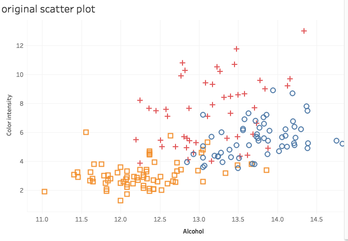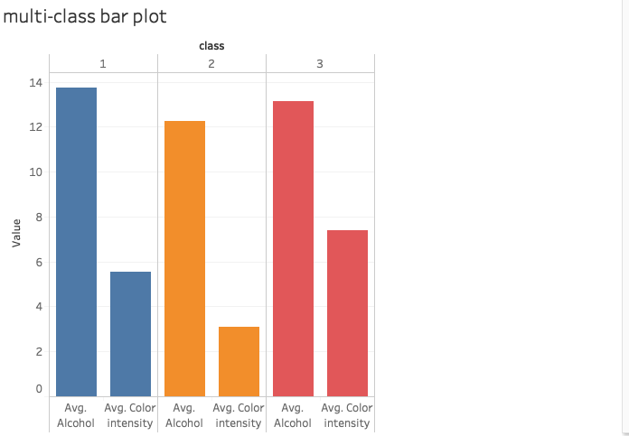


From the above, we can see that all the 5 graphs own the same content, which is the comparison of 3 class of wine in the dimension of Avg_Alcohol and Avg_Color_intensity. However, different visualization methods reveal different results, and give people different feelings.
The First one compares these two attributes in a parallel line, which cares more about the same attributes between the 3 classes. However the second one compare it through a jointly long bar, which cares more about these 2 attributes in a single class. The 3rd and 4th graph are also a little bit similar, while the 3rd is like a compressed and prepared version of 4th graph. The final graph just compares them very generally which doesn’t put emphasis on one thing but it also doesn’t lack something.
Finally, we conclude that class 2 owns the average both of the two dimensions. class 3 owns the highest colour intensity but middle alcohol. And class 1 owns the highest alcohol but a middle colour intensity.